Andy Blackmore on 2017 Formula 1 liveries
Renowned livery designer and artist Andy Blackmore takes a final look at the 2017 Formula 1 grid and offers his take on those who've won and lost the visual wars.
A constant topic of conversation during the build-up to the new Formula 1 season has been centered on new liveries, and in many instances, their bland applications by teams seeking to appease big sponsors wanting to play it safe.
Having previously worked on F1 designs for McLaren in the 1990's, and done some branding for Jordan and BAR back in the day, the need to honor corporate guidelines rather than artistic creativity is well understood.
Whether one approach is better than the other is a matter of opinion, and with so many debates raging over color choices by McLaren and Force India and the tedium found elsewhere on the grid, it's worth taking one last look at the 10 teams and their respective choices on what they've elected to present to the world.
ON THE PODIUM
First off, let's look at the teams who ticked the boxes both corporately and from a design and fan point of view.
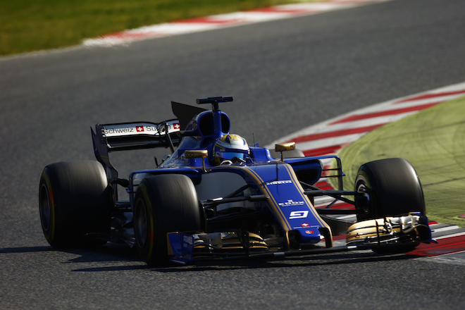
SCUDERIA TORRO ROSSO
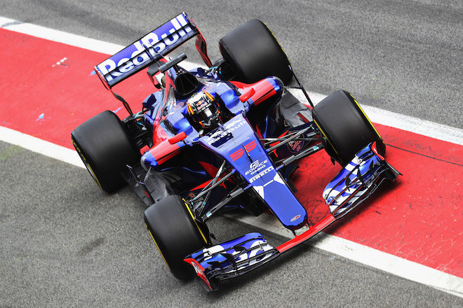
Toro Rosso hits the spot. Chrome Blue is very popular at the moment and the polar opposite of the Matte Blue shared by the sister Red Bull team.
Liveries should be more than just color with the availability of special paints, vinyls and material finishes to give contrast and clarity. In certain lighting, it's hard to see the "Red Bull" on the sidepod and I think this design could have really benefitted by a matte, satin or even traditional gloss Red Bull logo to contrast the chrome. It's important to consider when the chrome curved surface of the sidepod reflects off the dark grey track.
Regardless, this is nitpicking. Its going to look awesome under the lights in Singapore, going in and out of the Monaco and sunset in Abu Dhabi.
HAAS
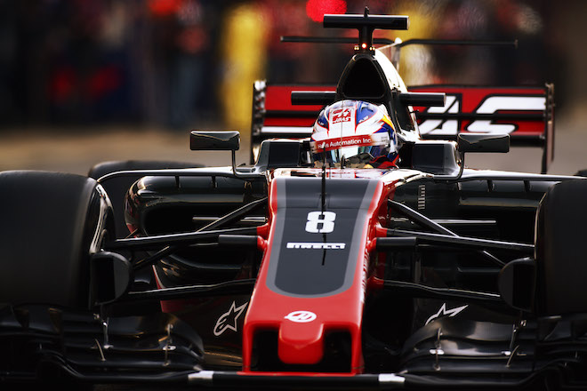
Thus the 2016 debut car design referenced the grey and off-white of their machines and were matched with a red nose and tail apparently inspired by the P51 Red tail fighter plane. This was visually held together with a vibrant red stipe which kicked up at a 30 degree angle, the same angle as the "H" in the Haas logo and used repeatedly on pit equipment, race transports and team identity. With no other sponsors to worry about, this worked well.
Fast forward to 2017 and designer Ryan Long has improved on a good start. The darker grey looks more aggressive and meaner and is in keeping with the CNC products the main organization looks to sell. The increase in the vibrant Red provides great contrast without diluting the brand. These colors also give the car a high-end look (remember the first West McLarens?).
Chatting with Ryan, one thing he pointed out is worth noting, and it's a real bother of mine in US racing: The correct usage of the stars and stripes on vehicles! (OK, I might not lie awake at night on this given I'm a Brit living in Canada)
People continue to point out the flag appears the wrong way around on the right hand side of the Haas F1 cars. It is, in fact, correct. The stars on military vehicles, uniforms and the flag pole are 'read' first and thus always forward facing. Whenever I create a livery for U.S. drivers, I always use this ruling. The monotone flag on the Haas cars also harkens back to a military look.
I love what Ryan has down with the "Big Honkin' Fin" (BHF) on the engine cover. Haas is one of few teams to embrace and use the fin as a separate graphic device as if the speed-lines are extending out of the engine cover. This makes the livery more dynamic and if you look closely, those 30 degree cuts and slashes remains and are even replicated in the new 2017 rear wing endplate.
Overall, the livery may be a little muted for some, but I think this is one of the strongest and most well resolved designs out there. Its simplicity and negative space reminds me of liveries from 20-30 years ago which people love today.
WILLIAMS
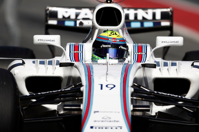
Along with Red Bull (and outside of F1, Monster Energy), Martini are one of the few brands which has a modern day Iconic livery. An iconic design comes about largely because the car doesn't change every year, and therefore, it becomes etched in people's memories. There are exceptions like the 7 Up Jordan, but generally, the Martinis, Marlboros, JPS and Gulfs of this world became iconic over time.
Also note, all of those are clean liveries, which has not been the fashion in recent years. If I had a dollar for every livery brief I received that requested an iconic livery from the outset, I'd be rich enough to place my kid in an F1 team....
As with most Martini liveries, the striping flows over the car from front to back, tapering around the form and for this year, the stripes extend dramatically onto the BHF utilizing that space as effective as Haas. The look is enhanced by the retro look with black front and rear wing elements. McLaren take note.
Notice all the sponsor logos are in the same dark blue. This makes the livery significantly cleaner and more connected which made so many of the older liveries look balanced.
COMING UP FROM BEHIND
SAHARA FORCE INDIA
I see this as a love or hate livery. I've read a surprising number of negative comments about the vibrant pink coloration, which I see a vast improvement on the boring silver launch livery from last month. In a time where people are complaining about tiresome F1 liveries, this totally bucks the trend and stands out from the crowd, which is your number one aim.
To my eye, the pink is a little too washed out and will apparently have a matte finish. Add in the blue "BWT" sponsor logo it almost looks like a bubblegum brand for those who are not aware of the brand outside its native Austria or the German DTM series where BWT have a presence. I'd say the announcement received more column inches, likes and shares than any other announcement. Job done?
I'm impressed Sahara Force India was able to convince the likes of NEC that its branding would work on a pink background. Also impressive is how a mid-level team has been able to attract a new sponsor from an industry new to F1.
If the BWT logos and accents end up being finished with a gloss, then this could be the icing (or bubblegum) on the cake.
RED BULL
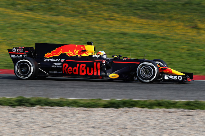
So that aside, the livery does work well and is an improvement over the 2016 car. The blue struggles to work with a matte finish, sometimes giving a slight purple hue; it's better suited to chrome and metallics (see Toro Rosso). I also find it strange Red Bull dropped their white key line around the logo, something they demand on any other racecar. Their corporate identity rules are very strict...unless you ARE the F1 team.
Take a quick look at the car, notice how ESSO really pops out with its bold font and high contrast white against the blue. Imagine that white around the words "Red Bull" on the sidepod, again in shadow, due to its aerodynamic form.
But, don't let this detract from how Red Bull have been extremely clever with their marketing and livery over the years. In an era of multiple logos and colors on every car, Red Bull bucked the trend, and not just in F1. While the current F1 car is more cluttered with sponsors, Red Bull's strong branding still dominates the car and the livery is one of the few modern iconic liveries in motion.
Most of the grid could learn from Red Bull ... its' just that matte isn't innovative!
MERCEDES
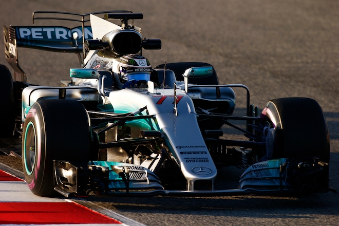
The 2017 livery is more effective. The black airbrushing on the engine cover remains, but the sweeps and arcs of lighter greens and teal on the side work really well – as if these are being dictated by the airflow around the car. A big improvement on recent years.
I don’t really see the point of the black on the engine cover, other than to provide contrast for the Mercedes star. I much preferred the earlier designs circa 2011 with the all-silver engine cover along with white roundels with red numbers – a nod to Mercedes’ strong grand prix heritage. Maybe, with the team’s recent success, Toto Wolff and his gang no longer need to live off the past.
RENAULT
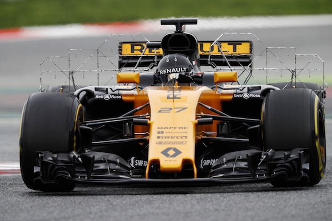
Small elements such as the satin finish on the black and the small wisps of white and yellow work really well as it follows the car’s bodywork. The livery looks better in plan view than from the side; it will be good for those at the top of the COTA tower shooting from overhead.
TAIL-END CHARLIES
SAUBER
While it’s great to see race numbers return in a prominent location, on this car, it is crude. Overall, it’s not an offensive design, and the Metallic Blue should look great in person, but a cohesive style is hard to locate.
MCLAREN
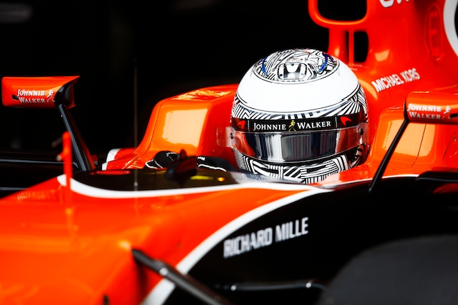
With the departure or Ron Dennis and many of his loyal support staff such as marketing master Ekrem Sami (an awesome mentor for me back in the day), it was probably the right time for an all-new look, but I do feel this falls short and the word in the pit lane is this was styled by a big committee. McLaren have an awesome graphics team that appears to have gone underused, so this may be the answer to some of the issues.
The actual design is quite at odds with McLaren’s usual approach, and while a black and orange split would be my starting point, the way it’s executed is a little strange. Unless you see the car in perfect side or plan view, the arc, referenced from the McLaren logo, ends up being disguised as it twists and turns over the aerodynamic form.
As many people have commentated, the orange today is much brighter than the traditional hue. It has to be said the original hue is quite washed out and won’t work on TV, so I understand the need to tweak the color. The orange used on the McLaren F1 LM supercar and the MP4-12 Test livery (which I helped to apply one night way back in January 1997) would have been a better choice.
The lighter hue would also help branding. Notice current car has white logos, probably because the orange comes across dark in black and white photography, whereas the older hues were lighter and had black logos.
In reality, it’s not a bad livery, but everyone has come to expect the best from McLaren and this would not be accused of such things. Having said all that, with the current issues facing McLaren and Honda, the livery really is the least of their problems.
FERRARI
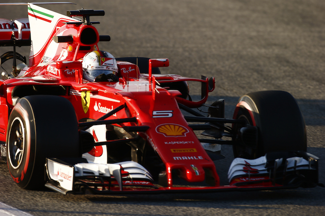
The Ferrari livery has got busier over the years which is an unfortunate change from decades ago where it was a simple Ferrari Red with black wings and a dash of yellow for Agip. Now, we have three full-color sponsors just on the side pod, all at different sizes, all on different base lines, and it looks more like a billboard.
The white BHF with the Italian “tricolor” works relatively well and highlights their history, but on the track, the white will give contrast to the asphalt and red bodywork, and I’m not convinced highlighting this unpopular fin in its own color is a good decision. A more modern graphic choice like the Haas would have been more effective.
Additional tricolor stripes along the side of the tub, and behind the Ferrari shield with more random logos around the nose make for a cluttered unbalanced livery. It’s the polar opposite of the memorable Ferraris that Villeneuve, Prost and a young Schumacher raced.
So, there you have it. Are the F1 liveries really that bad? No I don’t think they are. Some of the 2017 designs are a big improvement from last year. I’m sure the Toro Rosso will go down as a classic in a few years and join the Williams and Red Bull, but elsewhere, the grid is dragged down by some mediocrity and unresolved designs.
That’s my take on things. What do you like or dislike about the new liveries?
Andy Blackmore's designs can be found here.
Miss any of the team's car launches? Click on the thumbnails below for larger images.
{igallery id=1829|cid=613|pid=5|type=category|children=0|addlinks=0|tags=|limit=0}
Latest News
Comments
Comments are disabled until you accept Social Networking Cookies. Update cookie preferences
If the dialog doesn't appear, ad-blockers are often the cause; try disabling yours or see our Social Features Support.