Lancia photo
A completely biased list of racing’s coolest liveries
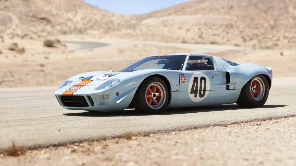
Motorsport has one of the greatest aesthetic opportunities imaginable at its fingertips, and yet, most racing cars don’t take advantage of it. I’m talking about liveries, of course. There are a great many iconic liveries we’ve seen in roughly 130 years of motorsports. From the triumphant Gulf orange and blue to the Lancias wearing Martini’s red, blue, and white underneath a fresh coat of splattered Earth. So many great liveries have adorned machines across the entirety of racing. We all have our favorites, and racing fans have been locking horns on whose subjective favorite is objectively right forever.
The beauty of the liveries debate is that it is utterly subjective and ever-changing. Every year, new liveries dot tracks around the world. Many on my subjective list, you'll find on other lists, but many you won't. If you do a quick Google search of "the coolest racing liveries," most articles will stick to what eventually feels like a prescribed rotating set of about 20 cars. This feels a bit limited considering the sheer number of liveries in the history of motorsport, and the blatant subjectivity beneath it all.
The well is deep, so let's send the bucket down.
Editor’s note:
If you find yourself cussing me out or taping a picture of my face to a dartboard because I left off your favorite livery, it’ll be OK. Do your cussing and carrying on. When you finish, I encourage you to take a breath and try to enjoy how cool these race cars are. And, of course, feel free to sound off in the comments telling me how wrong I am.
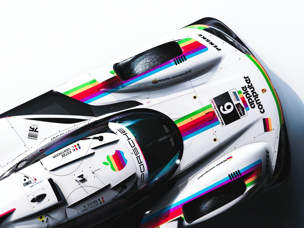
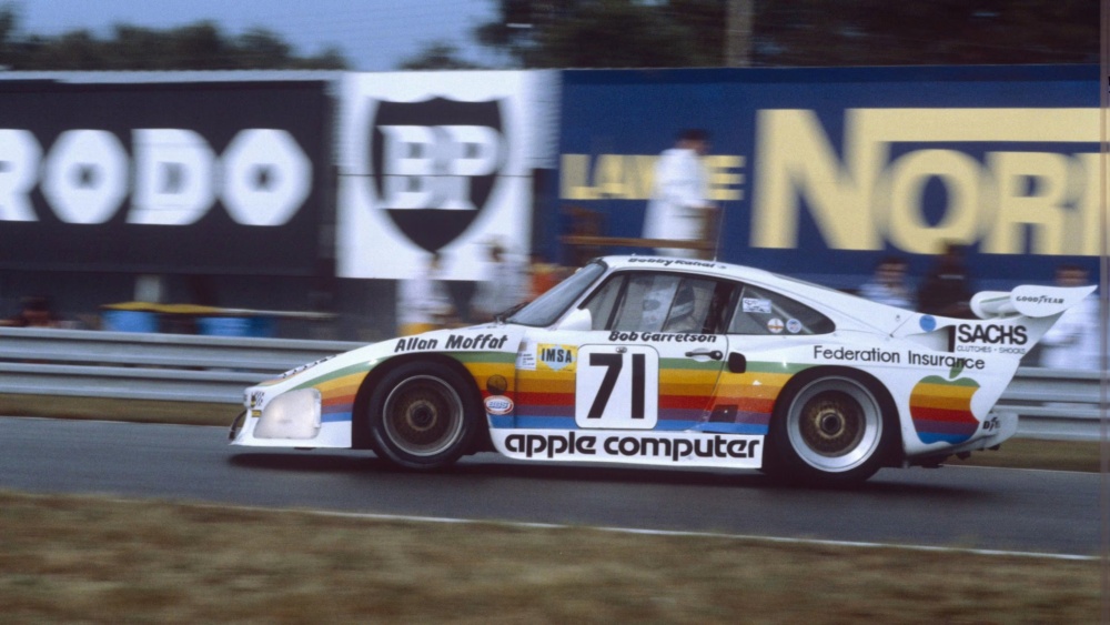
Apple Computer
There are a handful of liveries that are iconic because a car did amazing things while wearing them, but some are iconic because the design was so undeniably cool that we keep coming back to them. The second-place winning Porsche 935 Apple cars were kind of both.
Porsche Newsroom
Before Apple became the world’s most ubiquitous technology company, it sponsored one of the coolest race cars of the turbo era: a Porsche 935 K3 campaigned during the 1980 season by Dick Barbour Racing. The Kremer Brothers-built 935 K3 was one of the most formidable customer race cars of its era, producing roughly 750 horsepower in race trim and reportedly around 800 hp in qualifying. The standard Porsche 935 had already established itself as brutally fast in the late 1970s, but the K3 version sharpened the whole thing. Lightweight, twin-turbocharged, and deeply successful in international sports car racing, the 935 K3 quickly earned a reputation as one of the defining endurance racers of the period.
Porsche Newsroom
Apple’s involvement came through Bob Garretson, whose Mountain View race shop sat only a few miles from Cupertino. After Steve Jobs and Steve Wozniak visited the shop while having work done on Jobs’ Porsche 356, Apple signed on as the primary sponsor for the team. The resulting livery rose as an instant icon. The white Porsche wore rainbow striping inspired by Apple’s original logo, with “Apple Computer” stretched across the side skirts in the company’s classic Motter Tektura typeface. A small sticker on the rear simply read: “Don’t upset the Apple Car.” Driven by names like Bobby Rahal, Allan Moffat and Garretson himself, the car competed during the 1980 season at events including Sebring, Road America, Sears Point and Le Mans. Its competition run was relatively short and occasionally unreliable, but visually, the Apple 935 proved itself unforgettable.
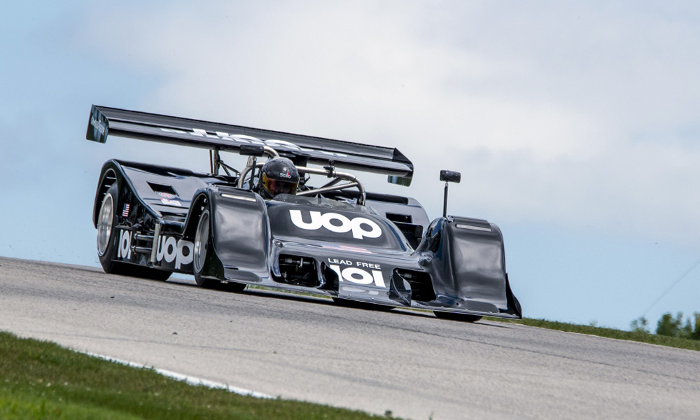
UOP Shadow
As a rule, I think the louder and more audacious the livery, the better. These are race cars, people. We should act like it. That said, the simple, black Shadow racing livery is one of, if not THE coolest, racing livery in the history of the sport. As many of you may already know, Shadow’s unmatched livery is the polar opposite of loud and audacious because a literal spy started Shadow Racing. Shadow has more than one livery that belongs on this list, but again, as we know, there are more liveries than we can take in, so let’s focus on the classic and touch on some of the others.
Scott Paceley photo
Emerging out of the wonderfully unhinged Can-Am era in 1970, Shadow became famous not just for building some of the strangest and most ambitious race cars of the period, but for wrapping them in some of the coolest liveries motorsport has ever seen. The black-and-white UOP Shadows looked like a supervillain’s whip. Even the sponsor sounded intimidating. Fans didn’t just say “the Shadow.” They said “the UOP Shadow,” like the whole thing was a single ominous object lurking somewhere in the paddock. At a time when Can-Am was a bit seedy and lawless, Shadow leaned all the way into the darkness.
Not every Shadow racing car came out of the paddock looking so menacing. The first F1 car fielded by Shadow was the Shadow DN1, and it was not great from any angle. It didn’t look great, and also didn’t run great according to its 1973 season record.
Still, some of the early cars were gloriously weird. The original AVS Shadow Mk I, nicknamed “the two-dimensional car,” looked impossibly low and radical even by Can-Am standards. It barely worked, terrified drivers (and children who stood too close), and almost never finished races, but none of that really matters here. As the team evolved through the 1970s under Don Nichols, Shadow slowly transformed from experimental oddity into legitimate racing powerhouse, winning the 1974 Can-Am championship with the beautiful DN4 and later scoring an improbable Formula 1 victory at the 1977 Austrian Grand Prix.
Through all of it, the liveries remained the team’s calling card, even when they stretched from the infamous black and white – looking at you, SAMSON (Dutch shag tobacco) livery. Long before modern F1 teams turned branding into hyper-optimized corporate wallpaper, Shadow understood the power of aesthetic identity. The Bible-black bodies, stark-white lettering, and evil silhouettes gave the cars a visual gravity that still oozes cool fifty years later. Even parked, they looked like they had cigarettes in a silver case and a tiny pistol hidden somewhere in the cockpit. Everything from Shadow’s type font, color scheme, and mascot screams, "Don't stare too long. We are engaged in some shadowy, clandestine operations."
The "Pink Pig"
Not all racing liveries were designed to be iconic. Many of them are simply the means to raise cabbages so the team can keep racing and the sponsor can advertise. Some liveries are specifically designed to bring attention to the car and the driver by simply looking good. Then there is the Porsche 917/20 "Pink Pig." This fleshy pink livery was designed in a semi-panic, as a joke, and ended up being one of the most beloved things Porsche has ever put on a race car.
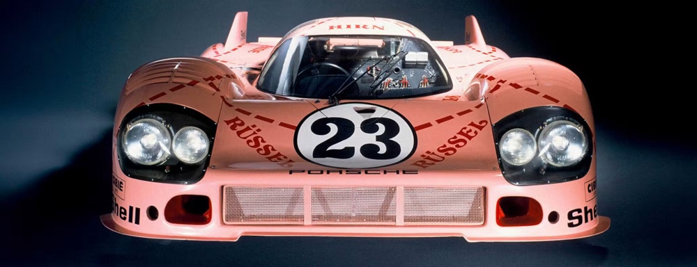
Porsche
The 917/20 was a one-off prototype built in collaboration with French aerodynamics specialist SERA, designed to combine the best qualities of the short-tail 917K and long-tail 917LH into a single car. The result was wider, rounder, and considerably more, uh, porcine in appearance than anyone at Porsche had envisioned. When Count Rossi of Martini & Rossi – one of the team's sponsors – saw it for the first time, he refused to let it race in the Martini colors. The car didn't look like what he'd signed up for. Porsche designer Anatole Lapine was handed the problem and returned with a solution that was pretty ballsy, to say the least. His approach was, "Well, if it's going to look so bulbous and pigish, let's go all in." Lapine presented a fleshy-pink paint scheme with the names of butcher's meat cuts stenciled across the bodywork in the style of a diagram from a cookbook. Rump. Shoulder. Loin. Belly. On a multi-million-dollar Le Mans prototype. It ran seventh fastest in qualifying, to boot.
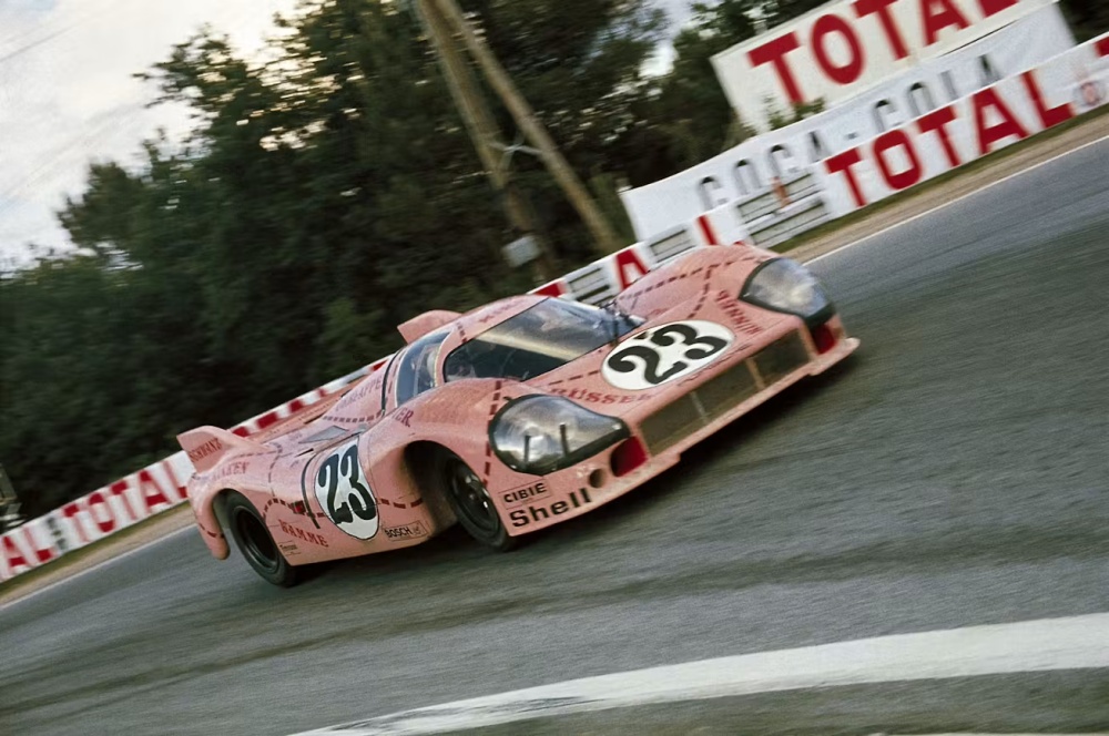
Porsche photo
The 917/20, chassis number 23, driven by Reinhold Joest and Willi Kauhsen, was running in third place at the halfway mark of the 1971 24 Hours of Le Mans before brake failure ended its race. It was the Pink Pig's only competitive outing. One race, one retirement, and still, all these decades later, it's one of the most enduring and beloved liveries in the history of motorsport. The porky Porsche picked up nicknames including "Big Berta," "The Truffle Sniffer from Zuffenhausen," and the German "Die Sau," which translates simply as "The Sow." The original car was put out to pasture at the Porsche Museum in Stuttgart. The livery returned to Le Mans in 2018 on a Porsche 911 RSR driven by Michael Christensen, Kévin Estre and Laurens Vanthoor – and this time it won the GTE Pro category outright after 344 laps. The Pink Pig had finally had its day. Even with its extremely limited time as a race car, this livery, born from a rejected sponsorship and an accidental resemblance to livestock, turned out to be more impactful than any Martini-striped Porsche, pound-for-pound.
BMW Motorsport stripes
Before we go too far here, literally any livery ever run on the BMW M1 deserves to be on this list. It’s a bit of an unfair platform. My daughter could scribble with charcoal on an M1, and it would be one of the coolest-looking race cars ever. So, in efforts to keep myself sane, we went with the Motorsport stripes. They are classic, timeless, and always look amazing, no matter which car you find them painted across. But those stripes on the BMW M1 are simply impossible to deny.
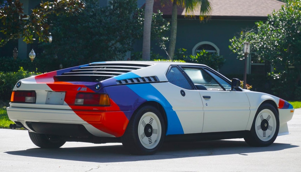
Niki Lauda BMW M1, photo courtesy of Mecum
The BMW M stripes – blue, violet and red – are one of the most recognizable livery elements in motorsport history. The official explanation for why BMW picked the color palette has always been tidy and satisfying: blue for BMW, red for motorsport, and violet as the natural marriage of the two sandwiched in between. Clean, logical, very German. And somehow a hug for the eyes. The real story, as it turns out, is considerably more interesting and involves a boogered sponsorship doomed to fail.
BMW photo
According to BMW Group Classic motorsport historian Marc Thiesbürger, the three-stripe livery was originally designed in the early 1970s by a man named Wolfgang Seehaus while BMW M was actively courting Texaco as a potential sponsor. The blue represented BMW and the Bavarian flag. The red represented Texaco, whose primary brand color it was. Early iterations of the design apparently featured the Texaco logo alongside the stripes – the only red in the composition at the time – which is the detail that sold Thiesbürger on the whole theory. The deal eventually fell through, Texaco and BMW never worked together, and the red got quietly rebranded as the BMW-assigned general color of motorsport rather than the color of a petroleum company. The livery stayed because it was too good to abandon, and BMW's revised explanation turned out to be workable. Sometimes the cover story is better than the truth, and sometimes it becomes the truth. This was both.
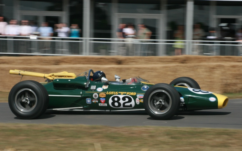
Lotus Gold Leaf
By the mid-1960s, the cash one needed to compete in Formula 1 was starting to add up, thanks to a boom in technology. For most teams, the growing costs were unsustainable without serious help from the sponsors. At this same time, F1 teams in particular would paint their race cars to match their nations’ adopted racing colors; English teams ran British Racing Green, Italians Rosso Corsa, the French ran bleu de France, and the Germans favored silver or white. These sorts of constraints were charming leftovers from a simpler world now slapdashly tumbling toward a new world of industrialized consumerism. Lotus needed money, and in this budding new world, one company was eager to help – for a price.
David Phipps/Getty Images
In 1968, team founder Colin Chapman signed a groundbreaking sponsorship deal with Imperial Tobacco's Gold Leaf brand. According to Sports Car Digest, the agreement reportedly brought Lotus roughly £85,000 per year. Still, it came with one major condition: the team would abandon its iconic British Racing Green colors and race in Gold Leaf's red, white and gold corporate livery.
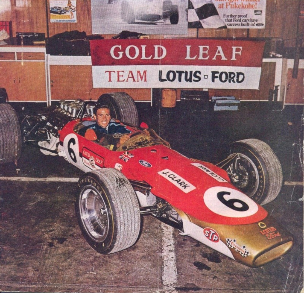
Lotus archive
Today, that sounds normal. Remember, in 1968, this was bordering on heresy. Lotus became the first major team to embrace commercial sponsorship as its visual identity fully, opening the door for modern motorsport marketing to feast on the cars and our attention. The move sparked criticism from traditionalists who believed Chapman had sold out one of racing's oldest customs. Like it or not, he helped create an entirely new business model for racing and branding. Without the Gold Leaf Lotus, there is no John Player Special Lotus, no Marlboro Ferrari, no Camel Trophy, Gulf GT40, Martini & Rossi Lancias, and arguably no modern era of racing liveries at all. That fated Gold Leaf car was responsible for kicking off what must be a trillion-dollar racing tradition and looked super cool, to boot.
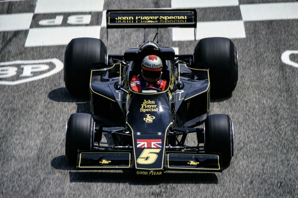
John Player Special
The John Player Special livery is not only an exceptionally good-looking racing livery, but it's also a significant trailblazer in motorsports history. Before it arrived, Formula 1 cars largely wore their national racing colors. English teams ran British Racing Green, Italians Corsa Rosa, the French ran blue and the Germans favored silver or white. That somewhat loose and uninspired system defined the aesthetic of top-level motorsport for decades. Then, in 1968, Colin Chapman and Lotus changed all that. After securing sponsorship from the Gold Leaf cigarette brand, Lotus abandoned its famous British Racing Green and yellow scheme and rolled out a new red, white and gold color scheme. It was a watershed moment that effectively launched the modern era of motorsport sponsorship and branding.
Ranier Schlegelmilch/Getty Images
The black-and-gold John Player Special design that followed a few years later took that revolution and perfected it. Introduced on Lotus F1 cars in 1972, the livery drenched some of the era's most innovative race cars in a classy black paint accented by elegant gold striping and lettering. The result was sophisticated, aggressive, and instantly recognizable from the other side of a racetrack. It looked expensive without being flashy and dramatic without trying too hard. More importantly, it established the template for what a great racing livery could be: a visual identity so strong that the colors themselves became synonymous with the team. Decades later, through all of Lotus' great many heroic drivers and championship-winning cars, the sight of a black-and-gold John Player Special car slicing through a cloud of cars will always highlight the difference between sponsorship and iconography.
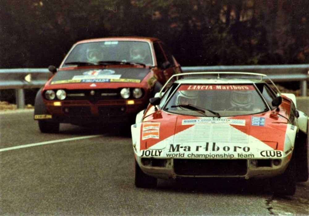
Alitalia
For a generation of rallying fans, the Lancia Stratos in Alitalia livery is the picture that appears in their heads when someone says "Group 4." That's impressive considering the Italian airline sponsored several race cars over the years, from Formula 1 machinery to endurance prototypes, and MotoGP. Yet the Stratos is still the definitive canvas for Alitalia's green, white, and red stripes. The partnership arrived in 1974, just as the wedgy beast hit its stride, and together they helped deliver three consecutive World Rally Championship manufacturers' titles for Lancia from 1974 through '76. It's hard to think of another sponsor and race car that fit together quite so naturally. (feel free to sound off in the comments)
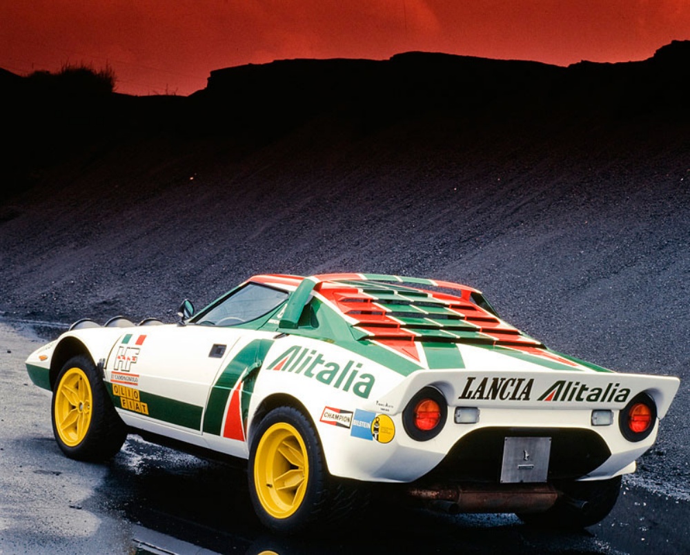
Bertone photo
Unlike any other racing livery on this list, the Alitalia livery’s true power comes from its wheels. If you look through Alitalia’s racing portfolio, you’ll notice a myriad of killer machines wearing the colors, but it's always the Lancia that sticks out. Why? Those yellow wheels.
The "A" logo, created in the late 1960s by branding legend Walter Landor, was intended to look clean and modern on the side of an airliner. As we know now, it worked even better stretched across a Stratos. The bold tricolor stripes accentuated the car's sharp lines, while the white base paint left room for the four stars of the show, those yellow wheels. I would argue that without them, the package would be woefully incomplete and far less interesting.
Of course, the Alitalia livery benefited mightily from being on one of the most successful rally cars ever built. The combination survived long after the factory program ended, migrating to later Lancias like the 037 and Delta in tribute form and spawning countless replicas along the way. Plenty of racing liveries are attached to great cars. The Alitalia Stratos feels more like design soulmates finding each other.
BASF
The 1981 Sauber-entered BMW M1 wearing BASF livery is not the first car that comes to mind when someone says "Le Mans icon." Even still, that doesn’t mean it isn’t one of the greats.
The BMW M1's track record at Le Mans was, to be charitable, not the best the race has ever seen. Over eight years of competition through the 1980s, only seven of the 22 M1 entries achieved classified finishes, with reliability being the polite word for what went wrong on a regular basis. Two class wins emerged from the wreckage. None of that matters here, though, because the BASF M1 isn’t on this list because it was good or fast. For ever lap it managed to turn with a fire, it looks unquestionably cool.
The genius of the BASF livery is that it had no business working as well as it did. Circles are not a naturally aerodynamic or racey shape. They do not suggest speed or aggression or any of the visual shorthand that racing liveries typically reach for. And yet BASF's bold, ever-decreasing concentric red circles – applied as large and confidently as the bodywork would allow – found their perfect host in Giorgetto Giugiaro's low, wide, shark-ish M1 body. The car's geometry did all the aggressive work, so the livery didn't have to. The result was something that looked part racing car and part Dr. Seuss-mobile flying down the Mulsanne Straight. It is so perfectly, irreversibly '80s. It's comforting in some way, like it isn’t trying to be too serious but still looks like a million bucks. It's one of those rare liveries that could not have existed in any other decade.
Whenever we see an M1 dressed up for race day, it's easy to say that whatever livery it wears is one of the greatest of all time. That car could make the East end of a horse heading West look good. But to prove that the BASF livery is nice no matter what it's on, droves of fans over the years have slapped those white circles on everything from Porsche 944s to a rendering of a BMW LMR1. No matter the shape, that livery commands adoration.
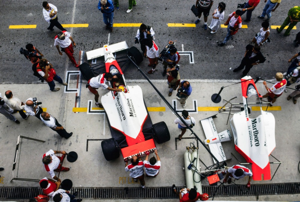
Marlboro
If we haven’t already been playing in the deep end of the livery pool, we certainly are now. The Marlboro livery is easily one of the best schemes to ever touch anything with four wheels, much less, specifically, race cars. Part of what makes the Marlboro livery so undeniable, aside from how good it looks on a car, is how many different versions of it there are, and they all look good. This vestige from a bygone era of cigarette ads and smoking sections in Ruby Tuesdays might be problematic or whatever. Still, in the 1970s and '80s, F1, as with many other racing series, wasn’t really as technological and polished as it is today. Cigarettes were a staple in the paddocks, so why not paint the cars up like a pack of smokes and let ‘er rip?
Rainer Schlegelmilch/Getty Images
Few racing liveries have escaped the confines of a single series quite like Marlboro's red-and-white colors. Aside from its stellar looks, the Marlboro livery started in F1 and spread like water over oil. While most fans associate the scheme with Formula 1 and the glory years of McLaren, the famous red chevron appeared on everything from Indy cars and rally monsters to endurance racers, touring cars, and even motorcycles. By the time tobacco sponsorship began disappearing from motorsport in the 2000s, Marlboro had become less a sponsor and more of a lifestyle. One glimpse of that sharp red wedge against a white background was enough to identify a car from half a mile away.
Marlboro first hit Formula 1 in 1972 with BRM, but its defining partnership arrived two years later when it joined forces with the mighty McLaren team. The timing could hardly have been better. In 1974, the Marlboro-backed McLaren M23 delivered both the constructors' and the drivers' championships with Emerson Fittipaldi. Gil de Ferran broke the world closed-course land speed record during qualifying at Fontana in 2000 in a Marlboro Team Penske car. It goes on like this with Marlboro cars. Over the next two decades, the livery became inseparable from some more legendary names you might recognize, including James Hunt, Michael Schumacher, Niki Lauda, Alain Prost and Ayrton Senna, to name a few. The design itself was remarkably simple: a white body interrupted by a bold red chevron, basically a 1:1 transfer from the cigarette packs. It was clean, aggressive, and instantly recognizable. It’s no wonder the Marlboro livery is one of the most enduring paint schemes in racing history.
.jpg)
Wikimedia Commons
What makes the Marlboro livery truly special, though, is how far it traveled beyond Formula 1. The colors adorned some of rallying's greatest machines, including the Baja Montesblancos Ferrari 308 GTB, and the Lancia Stratos, whose Marlboro-sponsored campaigns helped cement its place among the most celebrated competition cars ever built. The scheme also appeared on endurance racers such as the McLaren F1 GTR, Ferrari F1 cars, Porsche rally prototypes, and countless motorcycles across Grand Prix racing. Unlike liveries tied to a single team or championship, Marlboro's visual identity became a passport that crossed nearly every corner of motorsport. Whether wrapped around a Formula 1 champion, a Le Mans contender, or a dirty rally car slinging mud, the red-and-white chevron always looked absolutely, unendingly amazing.
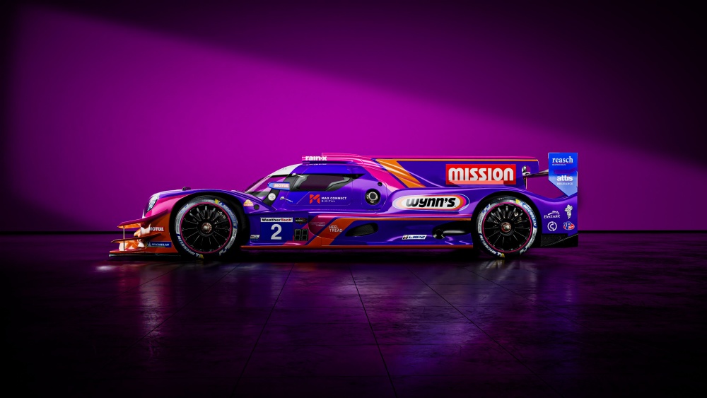
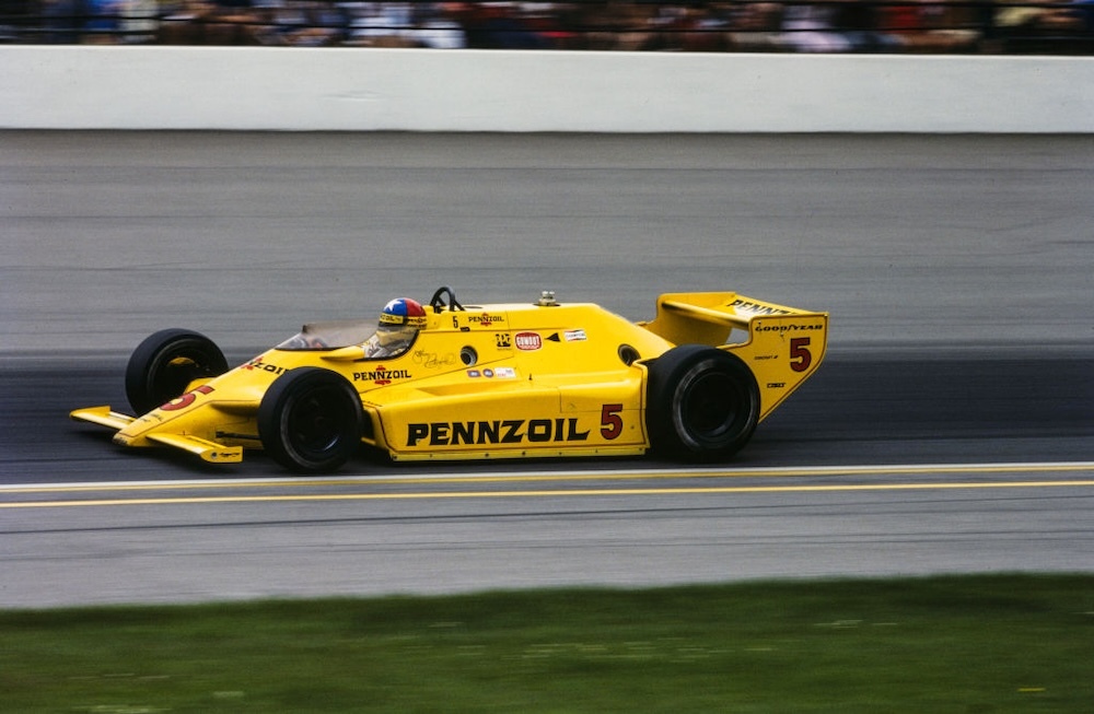
United Autosports Wynn's (ORECA 07)
As you might have noticed, all the greatest racing liveries we’ve looked at so far have been from the good ol’ cigarette days of racing. However, the old racing liveries are the only cool ones. One of the newest additions to the endurance racing livery greats is the vibrant purple, pink, and orange scheme on United Autosports' ORECA 07 LMP2 cars. Introduced for the team's 2024 IMSA campaign, the design wasn't cooked up in a marketing laboratory so much as inherited from driver Ben Keating's long-running partnership with lubricant giant Wynn's. Keating had campaigned variations of the color scheme in IMSA, Le Mans and more for years, carrying it with him when he joined United Autosports for its full-season IMSA effort. The team worked with designer Sean Bull to adapt the look to the sleek ORECA 07, creating a car that somehow manages to look like an endurance prototype and a synthwave album cover at the same time.
United Autosports photo
What makes the livery stand out is that it breaks one of sports car racing's more boring habits: most prototypes are painted to look serious. United Autosports instead leaned into high-visibility colors that practically glow under the lights. Mission Foods branding features prominently on the car. Still, the purple-and-pink Wynn's palette remains the star of the show, helping turn the No. 2 ORECA into one of the most recognizable LMP2 entries in recent memory. In a paddock full of stoic white cars with logos crowding the wheel wells and corporate cohesion, the United Autosports Mission/Wynn's livery simply goes its own way.
Land Rover Camel Trophy
The Camel Trophy Land Rovers occupy a strange corner of motorsport history because, technically, they are the least race-y cars ever made. Hell, they are more tractor than truck. Regardless, they went racing (well, sort of) and looked like a million bucks doing it. Well, they would have looked like a million bucks if you could ever actually see any paint through the ever-present secondary paint scheme: mud.
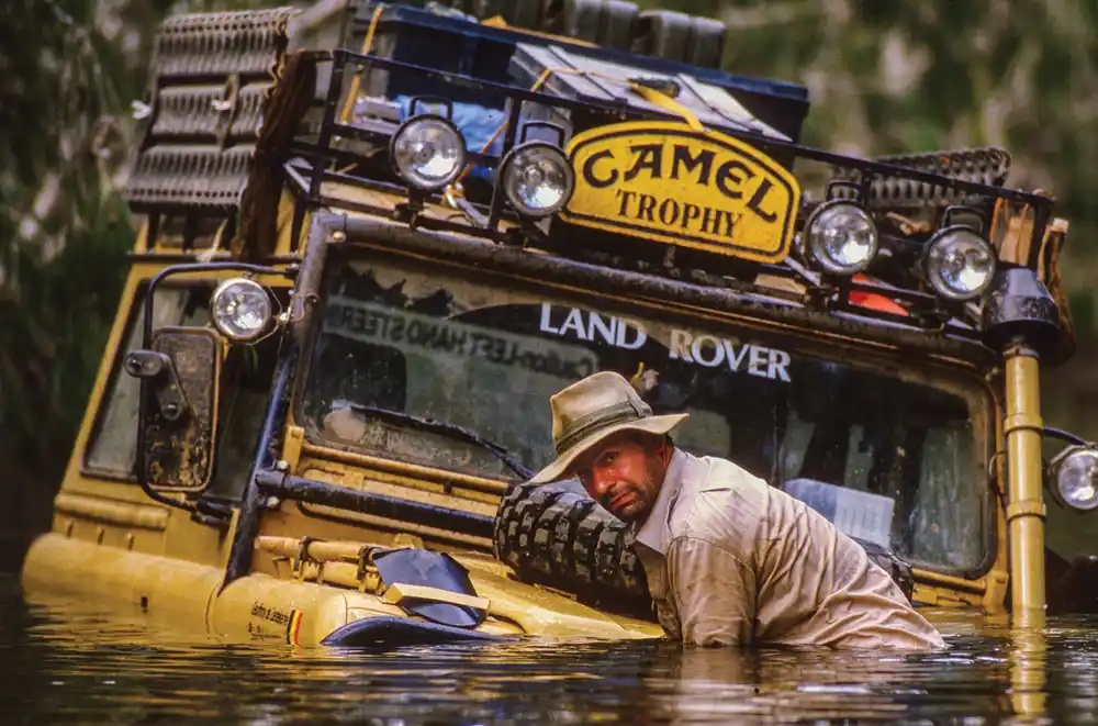
European Vintage Cars
The Camel Trophy began in 1980 as a promotional off-road expedition across Brazil's brutal Trans-Amazonian Highway, but Land Rover joined the following year and accidentally created one of the most recognizable automotive liveries ever. Finished in instantly iconic Sandglow Yellow, festooned with Camel logos, racks, ladders, snorkels, spotlights, spare tires and enough recovery gear to be mistaken for a paramilitary assault vehicle, these trucks were less ready to race and more aimed at surviving the apocalypse. The yellow paint wasn't just marketing. It made the vehicles easy to spot in dense jungle, river crossings, and mud pits, while turning every Land Rover into a hard-charging billboard for adventure – and cigarettes.

European Vintage Cars
Unlike most famous racing liveries, the Camel Trophy scheme earned its reputation by surviving rather than speed. Well, there was a fast Camel livery, too; a pretty quick little yellow flash showed up on F1 circuits in 1987, adding a little more zip to the stylish cigarette branding.
From Sumatra and Borneo to Madagascar, Siberia, and Papua New Guinea, Camel Land Rovers hauled competitors through some of the harshest terrain on Earth. The event eventually evolved into what fans called the "Olympics of 4x4," adding challenges like winching, navigation, kayaking and mountain biking alongside the driving. Land Rover's involvement lasted until 1998, spanning everything from the Series III and Defender to the Discovery and Freelander. Tobacco sponsorship and changing regulations eventually brought the event to an end, but the Sandglow Yellow Land Rover remains an indelible motoring icon.
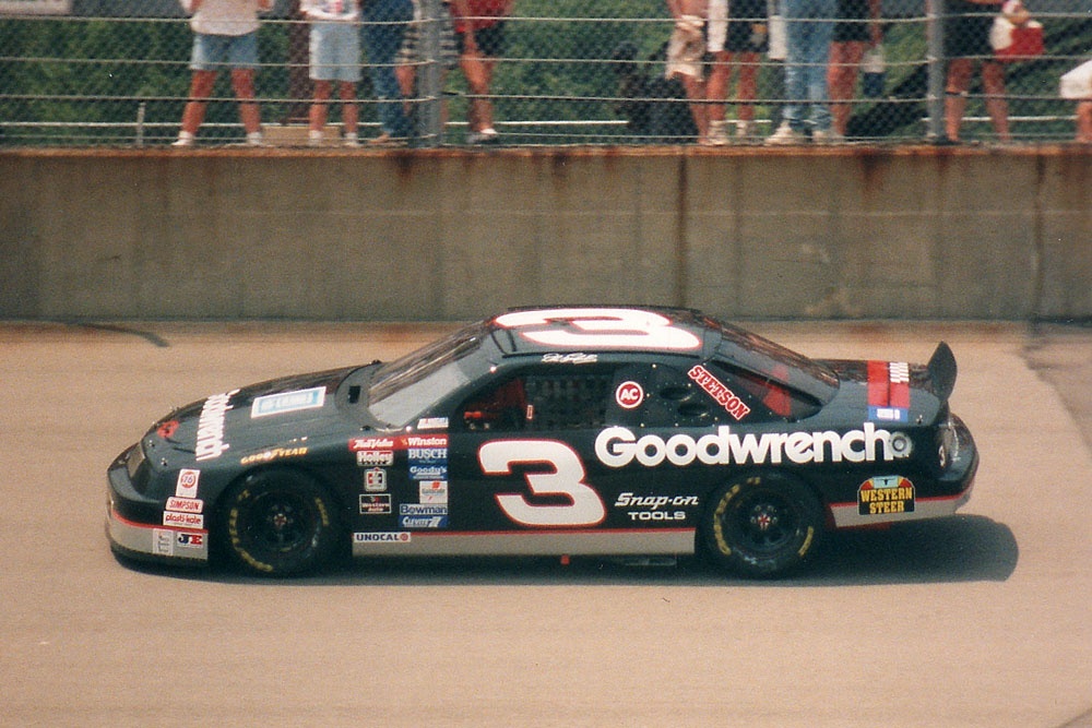
The Intimidator
Oh, baby. This is the livery to end all livery conversations. This one defines all conventions, breaks the mold, blazes new trails, or whatever else cliché you like. Dale Earnhardt and his No. 3 Goodwrench car transcend the sport, transcend livery, and transcend our plain of reality, maybe, I don’t rightly know. But I do know this: The Intimidator is the most iconic and instantly recognizable racing car that has ever and likely will ever exist, and I’ll hear nothing else about it.
Wikimedia Commons
While the famed black No.3 car would come to entomb Earnhardt’s legacy, it didn’t start there. The Intimidator (the man) drove a bunch of pretty famous and iconic race cars throughout his career. Sr.’s first No. 3 car was his 1984 yellow and blue Wrangler Chevrolet Monte Carlo; another great-looking race car. It wasn’t until 1988 that the long black train began stalking the raceways around America. Dale Sr. drove this car in many variations from ‘88 until 2001. But all the many cars Sr. drove throughout his entire life, none of them stuck like that black one. Aside from one of the coolest nicknames in sports – The Intimidator – that car also earned him another sinister nickname, The Man in Black.
Honorable mentions:
Courtesy of RM Sotheby's
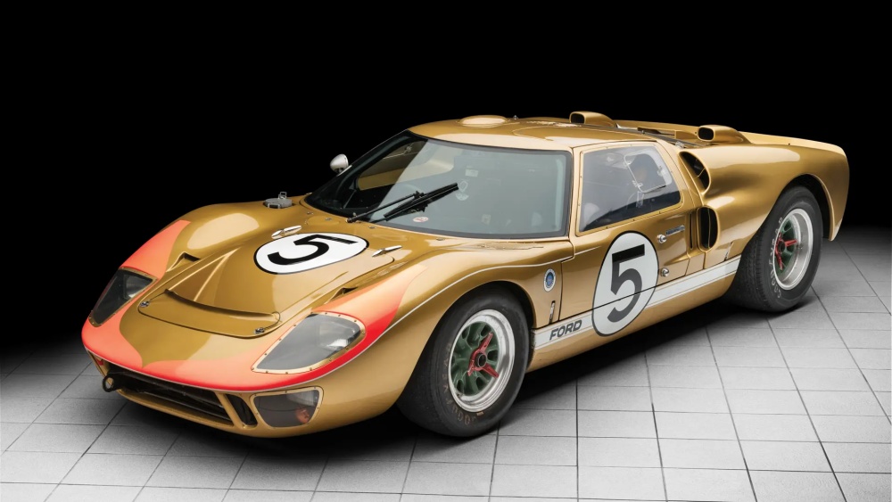
Kandy Gold and Pink GT40
Wikimedia Commons
Lotus' British Racing Green and Yellow
Getty Images
"Yellow Submarine"
Courtesy of RM Sotheby's
Johnny Lightning Special
Courtesy of RM Sotheby's
Gulf Oil GT40 (No, I didn’t forget it)
Pascal Rondeau/Getty Images
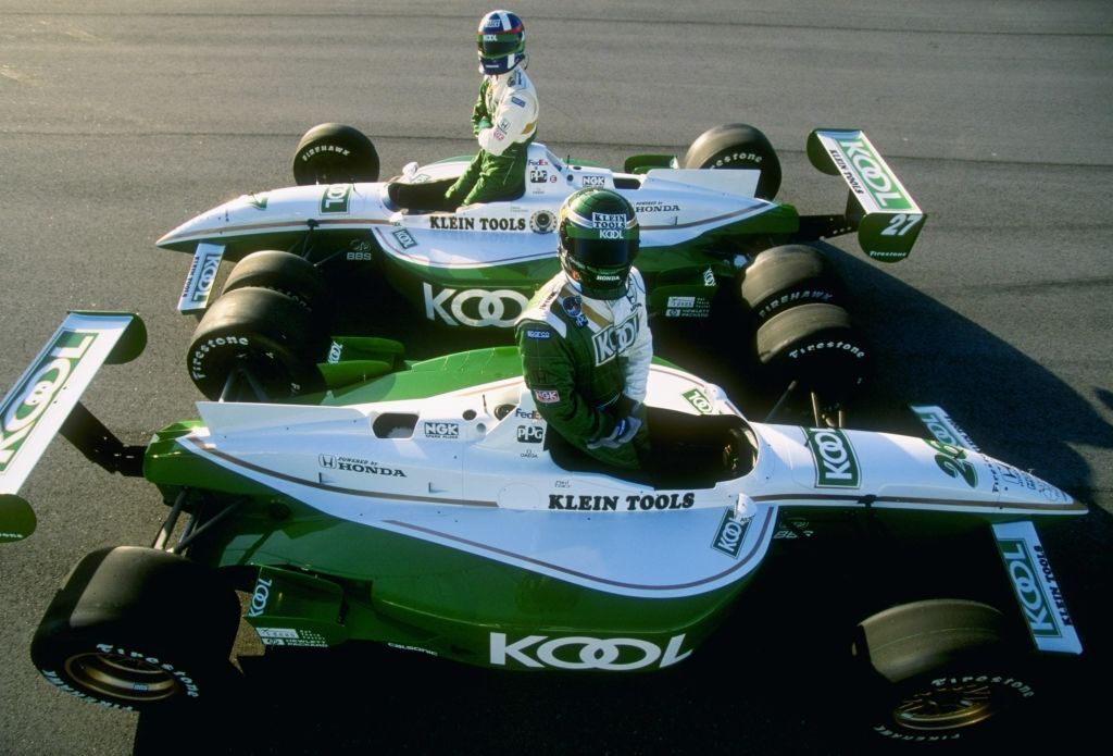
Team KOOL Green
Porsche
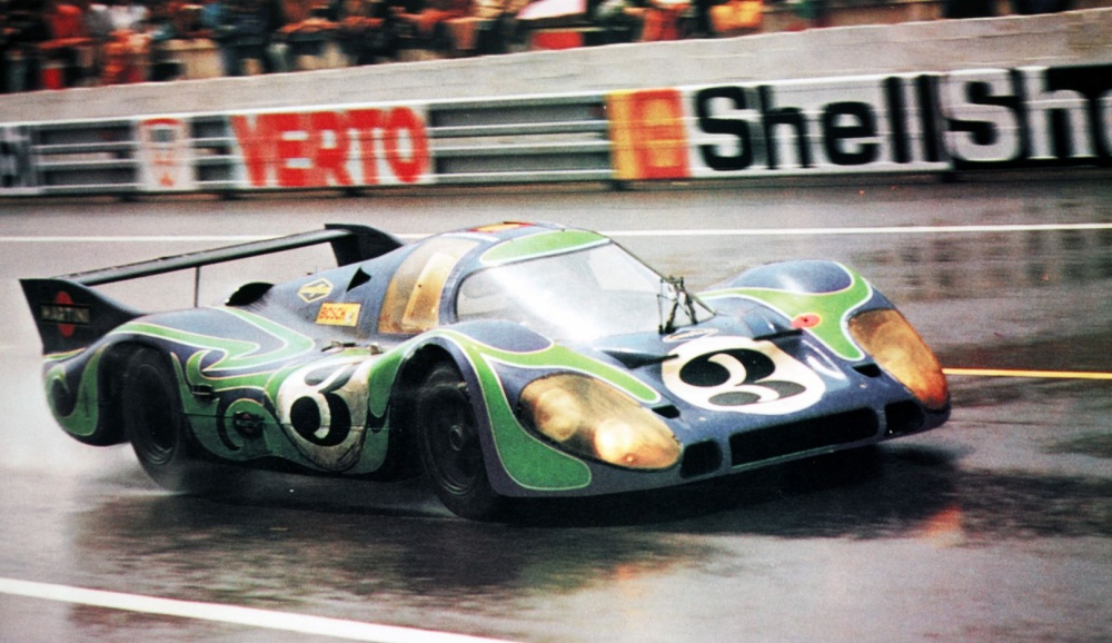
Porsche 917L Hippie Le Mans
RedBull
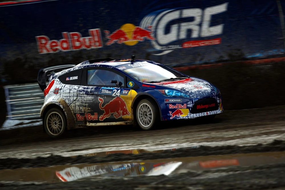
Red Bull Global Rallycross
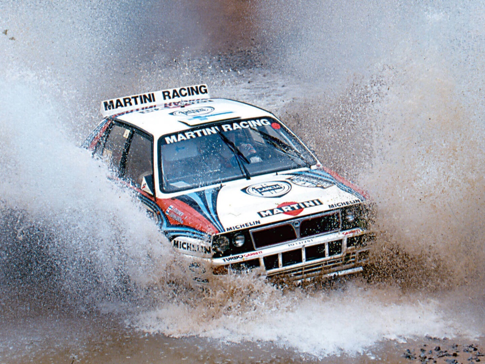
Martini Racing
Martini Racing (See, y’all can breathe now. I got you.)
Sutton/Getty Images
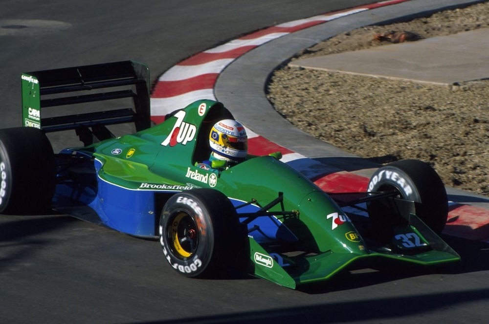
Jordan 191 7Up
Peter Corn
Peter Corn is an automotive writer and storyteller. Peter has spent nearly a decade writing about cars, trucks, and motorcycles for some of the best publications in the business. He believes the best automotive stories aren't really about the machines at all, but instead, the people who love them.
Read Peter Corn's articles
Latest News
Comments
Comments are disabled until you accept Social Networking Cookies. Update cookie preferences
If the dialog doesn't appear, ad-blockers are often the cause; try disabling yours or see our Social Features Support.